Thursday, 13 December 2012

The Isle of No Return

A few weeks ago, my class had to complete a 24 hour quiz using the surrealism technique. So here's mine :) 


Welcome to the Isle of No Return; a place where things are never what it seems. Over here, things look scary on the outside, but when enough courage is built up and chances are taken only then you will be rewarded. Decisions made here can never be taken back and you need to live through all your choices made. The Isle of No Return challenges you to cross your comfort zone and go where you have never dared to. Only when you dare to face your fears, will you then be rewarded with what this place has to offer.

Trapped


So for assignment's sake, these are some of the steps of how I designed my final artwork.


1st Step: I scanned my sketch, and re-sized it to fit an A3 size.


2nd Step: After a few corrections and modifications, this is my outline of my sketch. I used Crayon brushes that i downloaded, so that my sketch would have a more raw and rugged feel to it.  


3rd Step: I coloured the sketch, making sure i used darker tones, in order for my sketch to have a more somber feeling. The bars of the cage were coloured using 3 shades, to highlight the direction of the light in the picture.


4th Step: Shading of the child prostitute, although  it might seem so obvious (notice the lighter shade of the body)


5th Step: Shading of the hand was done, forming shadows at the bottom, to show light direction. 


6th Step: A basic background was done to set the mood of the sketch. This colour was chosen to show sadness, but also in a way to depict dirt, like how dirty and miserable her life is being a child prostitute. 

7th Step: I downloaded water colour brushes to creates splodges on the background, giving the art piece a cloudy effect, the opacity of it was reduced so that it could blend in with the background.

8th Step: An image of parchment paper was copied onto the file, to add a further "dirty" effect to the background; the opacity was also reduced. 


9th Step: I then downloaded the burnt paper effect brushes, to "burn" the edge of the parchment coloured background, to depict suffering and pain felt by the child prostitute.


10th Step: Finally, I used a light opacity glow brush to darken the art piece, darkening the piece and bringing an overall solemn effect to my artwork. 


And after all that work, I present to you .. Trapped. 


Sketch Sketch Sketch :)

So I've finally got sketches for my final assignment of the module. How time flies, it's crazy. My initial concept for the project was to highlight how people are not taking measures against child labour, despite the face that there is much awareness of this phenomenon.


After consulting my lecturer, he said that the message wasn't clear enough; and he suggested highlighting how children are forced into labour intensive jobs of sewing "branded" items. And thus i came up with this concept.


After finishing this sketch, I had an itching feeling inside, kinda like an unsatisfied feeling. My sketch seemed to shallow and now meaningful enough. That was when i remembered listening to Keane's video (Night Sky). And i came up with this concept, of how sometimes people think they are doing what is better for the child (because they can't afford to provide the child with a better life) and thus give them to people who claim to be caring and loving towards the child. Only to find that these sort of people have no good intentions at all. I thought of an idea to put lyrics from the song, to give more meaning to my sketch.


Theeeen i realized, copyright issues. Urgh :( ,  so it was back to the drawing board for me, the fourth idea of my sketch was pretty simple, whereby a dark black hole sucks the child away from it's parents. The black hole, being the black market.


And after a loooong hard thought, I FINALLY came up with my final sketch. Which is this ! I thought of cages, and how birds are always locked up in cages, never to be free. So this sketch holds the concept of child prostitution and how the child's life hangs in the hand of their kidnapper; never to be free. To further strengthen this concept, I did not draw any doors or locks whatsoever into my sketch, representing that there  is no way out for this poor girl. I call this piece, Trapped.


Monday, 26 November 2012

Art Movements

When researching on all the art movements I found the Constructivism and Renaissance art movementsto be the most interesting of all the 14 that were introduced to us in class. 


Example of Rennaisance Art
Source: http://bcm.bc.edu/issues/winter_2008/endnotes/smoke-and-mirrors.html
Ever since I was a kid, I've always had felt this drawn towards this from of art. Maybe it was because I had a strong interest in World History, but I think it was also because artist from the Renaissance period paid a lot of attention to detail. Strokes of paintings as well as colour choices were very precise. Besides that, the pieces that came from the Renaissance period holds much story behind what is being portrayed. 


Example of Constructivism Art
http://nikkor.tumblr.com/post/194137698/so-is-alexander-rodchenko-the constructivist
By looking through some of the Constructivism artwork from the internet, I noticed that most pieces use the colour red is used very often in Constructivism art. In my opinion, the usage of red helps to emphasize the message intended to be communicated. Most art pieces that came from the Constructivism period, were done to convey strong messages during  transitional times like the rise of feminism.


Wednesday, 21 November 2012

Keane - The Night Sky (War Child Version)


This video, speaks volumes. I want to base my drawings on the concept of this video. This video was made to highlight the issue regarding children in war torn countries. Just listening to this song has helped me conjure up so many ideas. Give it a listen :)


Thursday, 15 November 2012

The Sorting Hat

After almost two weeks of jumping from one sketch to another, I finally chose to sketch + re-paint this :). Of course anyone would know that this is the sorting hat from good ol' Harry Potter. When I was young i used to hope for a letter from Hogwarts and all to learn magic but yea, this sorting hat will be the closest I can get. Which house do you want to be in ? ;)

The Original Sketch with Colour
My Reproduction :)
I outlined all the lines that formed the hat and the shadow, then I slowly added in the colours using the Eyedropper Tool on Photoshop. Sad to say, I couldn't get the same texture as the original but i did try using Dry media brushes bring out some texture. All the colours were merged using the Blur Tool :) 


Monday, 5 November 2012

Light Filter


Another exercise from our tutorial :) This was to practice our skills to for photo shop.

Art Gallery

Last week, our class had a visit to the National Art Galley. So after having to rush from our Research Methodology Tutorial, we blindly went around KL looking for the galley and after a pain staking 1 hour, we finally reached the place. 

Once we got in, we had to walk to the top and slowly make our way downwards through the galleries, slowly observing the transition of art pieces of the local artist. Most of the pieces that were presented were very contemporary like. One of the works from the various artist that really captivated me was from Sivam Selvaratnam called Solitude.

The painting was of the back of a woman lying on the left side of her body. The main colours that were used by the artist was deep blue and a sort of "mossy green".  As I stood there, slowly looking at the details of the painting, I felt a gush of sadness and sympathy for the subject. The green-blue background, showed a sense of raw green emotions and despair. The artist made the back bone protrude making it seem like she was too skinny or somewhat starved. 

Thursday, 1 November 2012

Behold !!

My first Surrealism Project (ahhhhh)! 
3 long painstaking hours and many many layers later, here it is ! :D

It was kinda cool following the tutorial and learning how to better use Photoshop. I'm definitely in for doing more of these. So! from aaaalll these pictures:


Before adding the filters

After the filters

To THIS ! :D

 BOOOM ! :D 


Sunday, 28 October 2012

Colour Colour Colour

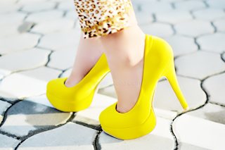
Come to think about it, I've never had a particular favourite colour. I would say that my favourite colour will depend on my mood for that moment in time. As of now, I am in this current obsession with YELLOW 


To me, yellow represents:
 
 
 Positivity
 
 
Being Daring
 
 
Individuality
 
 
Life
 
 
Freshness
 
 
Freedom


Happiness 


The Simpsons
 
 
Spongebob
 
 
And of course, Pikachu :)


I guess to me, everytime I see the colour yellow, I never fail to feel happy. It's the bright contrast it has on everycolour possible and its the brightness of it that gives good feeling inside you. :)


Inspiration

This might be a bit random but this is postcard is a major source of inspiration for my child abuse project. I visited Melbourne earlier this year and visited the National Gallery of Victoria to see the art. I stumbled upon this post card at the gift shop that I felt spoke volumes volumes to me.


 Anguish
 
I visited the gallery with my ex-classmate who is currently studying design at RMIT Melbourne and she was explaining to me what some of the paintings was about. So, she explained to me that the artist, August Friedrich, was trying to depict despair and sorrow. This art piece is called Anguish.
 
The mother sheep's lamb has died and the crows around her are just waiting for her to leave to lamb so that they can feed on it. But it's clear that the mother sheep does not want to leave :'( 
 
Looking at this picture just makes me think of how it might be like for parents with children who are forced into labour or are abused by others. Looking at this piece makes you think, and it makes you feel. The more I look at it, the more i feel like crying because of the morbid feeling and sadness of the mother lamb.
 
This picture is definitely what I will be basing my drafts on for this project :)


For the Sake of Creativity

Two weeks ago, our class had a field trip to Pasar Seni to have a look at some of the local art that KL had to offer. The Annex Gallery at Pasar Seni was closed, but we did go around and see the Grafitti by the longkang.


A CR-V parked in the middle of the pavement


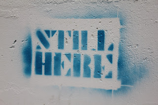
The subjectivity of this message is so intriguing
 
 A girl helping her dad sell drinks and food


Later on, my friends and I headed out to KLCC and Pasar Seni Market to go look see look see :P
 
Tasty cookies and snacks :D
  
The vibrant colours of Little India

Symphony Lake at KLCC Park

The interesting cloudy formation of the night sky